Neue Kit (German for new, said like "noya") is a performance focused, ITCSS based scaleable front-end kit. It's built for the modern web and only supports modern browsers although we are dragging IE11 along too! It includes a flex based fluid grid, common comprehendible JavaScript plugins and a minimalist style for all your friendly neighbourhood web elements.
There are 2 routes to get going with Neue Kit, you can either spin up a clean project with the Neue Kit structure or you can simply add the Neue Kit NPM package to your existing project.
                                npm install -g degit
                                degit neuekit/neuekit-starter yourprojectfolder
                                npm install
                                npm start
                                npm install neuekit --save
                                npm start
Neue Kit really is built for the modern web and as such only supports the cool kid browsers... and that kid who sits in the corner and eats flies.
Of course you can adjust the supported browsers by filling in the package.json browserlist config. Both the CSS and JS are configurable in this manner. See our default config on browserl.ist
- Chrome 49+
- Safari 12+
- iOS Safari 11+
- Firefox 63+
- Samsung 4+
- Opera 56+
- Edge 17+
- Internet Explorer 11+
- UC Browser 11.8+
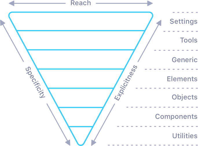
Inverted triangle CSS is a way to architect your styles. It focusses on organising your styles in order of reach and specificity, which makes your stylesheets easier to deal with. It aims to fix a classic CSS problem, coming back to a previous project or inheriting one and not knowing where new styles should go in the stylesheet. This is most commonly solved by adding them to the end of the sheet, which is less than desirable.
The grid system is simple to use, can create a wide range of layouts and utilises a mixture of settings and utilities to allow ultimate flexibility. Oh they are infinitely nest-able too!
The Neue Kit grid system is built with flex and with our handy utilities we can make use of all of the benefits that flex has to offer.
Here is a super simple grid declaration with a single full width column. By default a single column will try to take up 100% of the width of the parent.
                            <div class="o-grid">
                                <div class="o-grid__item"></div>
                            </div>
<div class="o-grid o-grid--item"></div>
Let's take a look at a grid with a few columns and an alignment class for good measure. This declaration will define 4 columns, centre aligned (see alignment utilities).
On mobile each column will be 100%, on tablets it will change to 50% per column and on desktop 25% per column. There are 12 size classes in the default setup, which can be changed to any number, along with gutter sizes too.
                            <div class="o-grid  u-alignCenter@l">
                                <div class="o-grid__item  u-size-6@m  u-size-3@l"></div>
                                <div class="o-grid__item  u-size-6@m  u-size-3@l"></div>
                                <div class="o-grid__item  u-size-6@m  u-size-3@l"></div>
                                <div class="o-grid__item  u-size-6@m  u-size-3@l"></div>
                            </div>
There are a whole heap of classes you can use to customise the grid to your liking, these are added top level alongside your o-grid class:
o-grid--itemThis can be used if you only need a single column, which saves a div 😁o-grid--maxThis removes themax-widthrestriction on the grid, making it fill the screen.o-grid--edgeThis strips the gutters from your columns, enabling them to go edge-to-edge.o-grid—-unnestThis doubles the negative margin which may be needed to reverse nested grid padding.o-grid--nestThis does the opposite of the above and allows a nested grid to be inset visually.o-grid--items-2Addingitemsplural and specifying a number sets the columns at the parent level...
You can layout your grid at the parent level if your columns are all the same width, you can even do this for each breakpoint. This can be especially helpful if you don't know the number of columns you have to display, if they are pulled dynamically for example.
                            <div class="o-grid  o-grid--items-6@m  o-grid--items-3@l">
                                <div class="o-grid__item"></div>
                                <div class="o-grid__item"></div>
                                <div class="o-grid__item"></div>
                                <div class="o-grid__item"></div>
                            </div>
As shown above the grid makes use of the size utility classes, which are not restricted to the grid. You can customise the number of size classes in the settings layer. (See size utilities) Here's a broad example of the default available size classes and how you may apply them to the grid.
                            <div class="o-grid">
                                <div class="o-grid__item  u-size-6@s  u-size-3@m  u-size-2@l  u-size-1@xl"></div>
                                <div class="o-grid__item  u-size-6@s  u-size-3@m  u-size-2@l  u-size-1@xl"></div>
                                <!-- Repeat -->
                            </div>

                            <div class="o-grid">
                                <div class="o-grid__item  u-size-4"></div>
                                <div class="o-grid__item  u-size-auto"></div>
                                <div class="o-grid__item  u-size-auto"></div>
                            </div>
u-size-auto fills the remaining space and if you use more than one the space is divided up and shared equally among them.
One of the strengths of pulling helpers out into utilities is that we can use them with anything. Neue Kit comes with utilities for all sorts of things, and flex utilities come in handy when defining your layouts.
                        <div class="o-grid  u-alignCenter  u-between  u-justifyCenter@l">
                            <div class="o-grid__item  u-size-6  u-size-2@m">
                            <div class="o-grid__item  u-size-4@m">
                            <div class="o-grid__item  u-size-6  u-size-2@m">
                        </div>
Head over to the utilities section to see the full range of helpers on offer and how you can use them in your project.
Sometimes if your designer is feeling particularly edgy they may create a wonderful arymetric page layout with areas that are being pulled and pushed outside the confines of the grid.. and you need to somehow create this using a grid system 😳
This is where the offset utility can help you out!
                            <div class="o-grid">
                                <div class="o-grid__item  u-size-8@l u-outsetLeft-2@l"></div>
                                <div class="o-grid__item  u-size-6@l"></div>
                            </div>

                            <div class="o-grid">
                                <div class="o-grid__item  u-size-4@l  u-inset-2@l"></div>
                                <div class="o-grid__item  u-size-7@l  u-outsetRight-1@l"></div>
                            </div>
Usage of the grid mixin is simple, you can import it like so:
@include nu-object__grid();
Or you can go anonymous and import the guts of the object without the parent class name, this is super useful when you want to make serious changes to a Neue Kit mixin.
                            .mySuperGrid {
                                @include _nu-object__grid();
                            }
| Parameter | Type | Default | Description |
|---|---|---|---|
| $gutter | Pixel Value | 8px | Sets the gap between grid items |
| $gutterSmall | Pixel Value | 8px | Enables a different gap on mobile |
| $mediumBreakpoint | String | m | The point at which the gutter change happens |
| $maxWidth | Pixel Value | 1380px | Sets the maximum width of the grid container |
The utility layer is home to many small css classes, that ordinarily take on a single simple task. This layer edges towards the end sharper point of the itcss triangle and as such it is not uncommon for classes to be doubled to ensure they are more specific than nest classes.
This utility creates simple potentially helpful classes that you can use to set the background colour or text colour of any element. These are created based on the colour variables set out in the settings layer.
                            <figure class="u-bgNoir">
                                <img src="michael.jpg" alt="Michael Scott">
                                <figcaption class="u-colourSnow">You don't know how high I can fly</figcaption>
                                </figure>
As mentioned the utility relies on a scss map declared as $palette see the following example for how to declare said map.
                            $palette: (
                                'primary':      $primary,
                                'secondary':    $secondary,
                                'tertiary':     $tertiary,
                                'quaternary':   $quaternary
                            );
| Parameter | Type | Default | Description |
|---|---|---|---|
| $palette | Setting Var | $palette | Passes in the project colour palette map |
| $lightnessTolerance | Integer | 50 | Sets threshold for the level of darkness a background colour must have before setting the text to a light colour |
| $lightnessColour | String | white | Colour to apply to text on dark background colours |
| $utilities | Map | (background, colour) | Map defining which classes to create |
There are a fair few flex helpers to help you create a wide variety of layouts.
u-flexAddsdisplay: flexto any elementu-inflexAddsdisplay: inline-flexto any element
Available in breakpoint format eg. u-row@xs, u-row@s, u-row@m, u-row@l, u-row@xl
u-rowaddsflex-direction: rowu-columnaddsflex-direction: columnu-rowReversaddsflex-direction: row-reverseu-columnReverseaddsflex-direction: column-reverseu-justifyStartaddsjustify-content: flex-startu-justifyCenteraddsjustify-content: centeru-justifyEndaddsjustify-content: flex-endu-alignStartaddsalign-items: flex-startu-alignCenteraddsalign-items: centeru-alignEndaddsalign-items: flex-endu-aroundaddsjustify-content: space-aroundu-betweenaddsjustify-content: space-betweenu-wrapaddsflex-wrap: wrapu-nowrapaddsflex-wrap: nowrap
Available in breakpoint format eg. u-grow@xs, u-grow@s, u-grow@m, u-grow@l, u-grow@xl
u-growaddsflex-grow: 1u-noGrowaddsflex-grow: 0u-shrinkaddsflex-shrink: 1u-noShrinkaddsflex-shrink: 0u-alignSelfStartaddsalign-self: flex-startu-alignSelfCenteraddsalign-self: centeru-alignSelfEndaddsalign-self: flex-endu-firstaddsorder: -1u-lastaddsorder: 1
| Parameter | Type | Default | Description |
|---|---|---|---|
| $responsive | Map | (up, only) | Sets the responsive rules for class generation |
Offsets enable you to pull and push items around, especially useful when you need to create artistic layouts with the grid. Although these can be used anywhere.
Available in breakpoint format eg. u-inset-1@xs, u-inset-1@s, u-inset-1@m, u-inset-1@l, u-inset-1@xl
Classes end in a number, 1-12 by default, reflective of the number of columns configured
u-inset-1applies a positive left margin as a percentage to any elementu-outsetLeft-1applies a negative left margin as a percentage to any elementu-outsetRight-1applies a negative right margin as a percentage to any element
| Parameter | Type | Default | Description |
|---|---|---|---|
| $responsive | Map | (up, only) | Sets the responsive rules for class generation |
A size class sets the flex basis property of a flex child. It can be used to set the width of any element also. Typically this is matched with the grid, but is not limited to the gird.
Available in breakpoint format eg. u-size-1@xs, u-size-1@s, u-size-1@m, u-size-1@l, u-size-1@xl
Classes end in a number, 1-12 by default, reflective of the number of columns configured
u-size-autoapplies flex grow to the element, filling the available spaceu-size-1applies flex basis as a percentage to any flex child element
| Parameter | Type | Default | Description |
|---|---|---|---|
| $responsive | Map | (up, only) | Sets the responsive rules for class generation |
The need for declarative margin and padding helpers comes around for more frequently than we would like to admit. Neue Kit has a mixin that can create the classes for you.
To start there a few non-breakpoint classes for the safe padding area, often required for devices like the iPhone X as a way to deal with the notch.
u-safeArea-lapplies padding left using thesafe-area-inset-leftvalueu-safeArea-rapplies padding right using thesafe-area-inset-rightvalueu-safeArea-tapplies padding top using thesafe-area-inset-topvalueu-safeArea-bapplies padding bottom using thesafe-area-inset-bottomvalueu-safeArea-hcombines bothu-safeArea-landu-safeArea-ru-safeArea-vcombines bothu-safeArea-tandu-safeArea-b
Available in breakpoint format eg. u-mL-4@xs, u-mL-4@s, u-mL-4@m, u-mL-4@l, u-mL-4@xl
u-mL-aapplies margin left autou-mR-aapplies margin right autou-mT-aapplies margin top autou-mB-aapplies margin bottom autou-mH-acombines bothu-mL-aandu-mR-au-mV-acombines bothu-mT-aandu-mB-au-mL-4applies margin left at the specified size using the rem unitu-mR-4applies margin right at the specified size using the rem unitu-mT-4applies margin top at the specified size using the rem unitu-mB-4applies margin bottom at the specified size using the rem unitu-mH-4combines bothu-mL-4andu-mR-4u-mV-4combines bothu-mT-4andu-mB-4
Available in breakpoint format eg. u-pL-4@xs, u-pL-4@s, u-pL-4@m, u-pL-4@l, u-pL-4@xl
u-pL-4applies padding left at the specified size using the rem unitu-pR-4applies padding right at the specified size using the rem unitu-pT-4applies padding top at the specified size using the rem unitu-pB-4applies padding bottom at the specified size using the rem unitu-pH-4combines bothu-pL-4andu-pR-4u-pV-4combines bothu-pT-4andu-pB-4
| Parameter | Type | Default | Description |
|---|---|---|---|
| $attrs | Map | (padding, margin) | Declares spacing types to create |
| $dash | String | '-' | Set the character between the classname and the unit |
| $rem | Boolean | true | Toggle for pixels or rem values |
| $responsive | Map | (up, only) | Sets the responsive rules for class generation |
| $steps | Map | (0, 4, 8, 12, 16, 20, 24, 32, 40, 48) | List of spacing sizes to create |
| $directions | Map | (top, bottom, left, right, vertical, horizontal) | List of directions to create |
There are many available text utility classes ready for use in the kit. By default the mixin includes them all but you can cherry pick the ones you actually using. 😁
First the non-breakpoint classes
u-textBolderappliesfont-weight: bolderu-textLighterappliesfont-weight: lighteru-textStrongappliesfont-weight: 600u-textSuccessappliescolor: $successu-textWarnappliescolor: $warnu-textErrorappliescolor: $erroru-textDisabledappliescolor: $disabledu-textLowerappliestext-transform: lowercaseu-textUpperappliestext-transform: uppercaseu-textCapsappliestext-transform: capitalize
Available in breakpoint format eg. u-pL-4@xs, u-pL-4@s, u-pL-4@m, u-pL-4@l, u-pL-4@xl
u-textStartappliestext-align: startwith a fallback totext-align: leftu-textCenterappliestext-align: centeru-textEndappliestext-align: endwith a fallback totext-align: rightu-textJustifyappliestext-align: justifyu-textGrowappliesfont-size: 125%u-texthrinkappliesfont-size: 75%u-textNowrapapplieswhite-space: nowrapu-h1enables the h1 element styling to be applied to any elementu-h2enables the h2 element styling to be applied to any elementu-h3enables the h3 element styling to be applied to any elementu-h4enables the h4 element styling to be applied to any elementu-h5enables the h5 element styling to be applied to any elementu-h6enables the h6 element styling to be applied to any elementu-s1applies a size between h1 and h2u-s2applies a size between h2 and h3u-s3applies a size between h3 and h4u-s4applies a size between h4 and h5u-s5applies a size between h5 and h6u-s6applies a size below h6
| Parameter | Type | Default | Description |
|---|---|---|---|
| $responsive | Map | (up, only) | Sets the responsive rules for class generation |
| $utilities | Map | ( text-start, text-center, text-end, text-grow, text-shrink, text-bolder, text-lighter, text-strong, text-justify, text-success, text-warn, text-error, text-disabled, text-lower, text-upper, text-caps, text-nowrap ) | Declares the types of classes to create |
Quick access to classes enabling you to hide, show, lock and position all or parts of elements can be found here. By default you get all of these when including the mixin but again you can cherry pick the ones you are actually using.
Available in breakpoint format eg. u-hide@xs, u-hide@s, u-hide@m, u-hide@l, u-hide@xl
u-hideappliesdisplay: noneu-blockappliesdisplay: blocku-inblockappliesdisplay: inline-blocku-lockedappliesoverflow: hiddenu-stickyappliesposition: stickyalong required properties for the polyfillu-radiusappliesborder-radius: $radiusu-pointerNoneappliespointer-events: none
| Parameter | Type | Default | Description |
|---|---|---|---|
| $responsive | Map | (up, only) | Sets the responsive rules for class generation |
| $utilities | Map | ( hide, block, inblock, locked, radius, sticky, pointer ) | Declares the types of classes to create |